The industry of web design is a constantly growing sector with new development approaches appearing on a permanent basis. New technologies come in, yesterday's novelties become outdated. Web design, as well as web technologies in general, is changing rapidly. And every designer needs to follow these changes in order not to lose their own individuality and style. How is this possible?
First of all one should try to avoid general mistakes. There are hundreds of common mistakes that can be made. Some of them are pretty obvious and some are worth of few hours' discussion. In this article, you will find tips on what you should do or not do so that your designs come out great.
Content Mistakes:
- Make it clear what your website is about. Once logged in, a visitor should immediately understand what a website is about. Capturing visitors' attention is one of the highest priorities for the website. If a visitor comes to the website and within a few seconds they don't find what they were looking for – chances are they will leave.
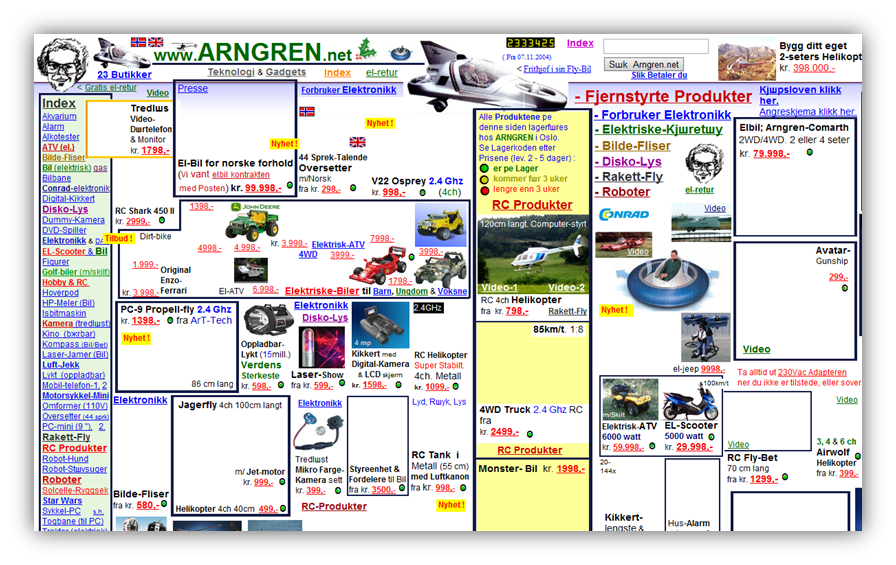
- Be careful with content overflow. Again, it is about user's attention. It looks both unprofessional and unpresentable, when there are too many photos, images and banners all on the same page.
- Make the content readable:
![readable content]()
- Do not use a flashing, flickering text.
- Paragraphs should consist of no more than two or three short sentences.
- A text must contain headings, subheadings and lists.
- The most important parts of the text should be marked in bold, italic, etc.
- Pay attention to fonts:
![multiple fonts]()
- Do not use unusual or non-standard fonts. Yes, some non-standard and readable fonts can add up elegance and sophistication to the site, but what would be the use of those fonts if they were visible only to their author?
- Avoid the use of too small or too large fonts. Always prefer the font size that is well-readable and easy to understand.
- Choose one or two fonts for the whole website. Avoid using multiple fonts.
- Do not place ads inside the content of the website. Many advertising links, for example Google Adsense, are hidden in content to increase the number of clicks. But think twice before doing so: this may cause losing visitors.
![too many ads]()
- Do not underline plain text. We strongly recommend avoiding underlined plain text. Because for users underlined text is immediately associated with links. When they see that the underlined text is not a link, they may be disappointed. You don't want that, do you?
Pressure on User:
- Don't use pop-up windows. This rule is applicable for all pop-ups with no exceptions.
![pop-up windows]()
- Do not use harsh, irritating colors online. If a visitor gets a headache after 10 minutes of surfing your website, they will probably never come back. So it is a sure sign that you need to change the color scheme of the website.
![harsh colors]()
- Do not open new windows in browser with the links from your website. This is a very common mistake for many webmasters. Let the visitor decide: where to open the window from a particular link.
- Never change the size of the browser window. Never change the default settings. Visitors may have negative attitude to this kind of intervention. You should be aware that by changing the user's settings, you will most likely turn the visitors away from your website.
- Do not force visitors to register. Recently it has become a common practice: demanding from visitors to complete the registration process to get access to content. Therefore, make it a golden rule to skip registration, and more users will want to surf your site.
![force to register]()
- Do not abuse the use of Flash. Besides the fact that Flash increases loading time, an excessive use of it may extensively annoy visitors. Use flash only where you can't have static pages.
- Do not use unexpected sounds. Do not include automatic background music. This practice was widely used back in the day. Well, those days are gone, the situation has changed. Fix this error, if it still exists on your site. Certainly, there are situations when you need to give visitors a preview or a message. In that case, the best option would be giving your visitors an option to listen to this audio with the buttons "Play / Pause" and "Stop".
Complicated Web Design
- Do not put various banners on your website. It is not a good idea for two major reasons: 1) such a site seems way unprofessional; 2) all of these banners will increase loading time.
![complicated design]()
- Do not use the "doorway" pages, splash pages, etc. Remember! The faster a visitor gets to the useful and interesting content, the better. So forget about using all kinds of "intro" pages.
- Avoid using tables for layout, go to the block layout (xhtml + css). HTML-tables were utilized for pages layout. But right now, when we have CSS, there is no reason to stick to this method. CSS is faster, more reliable and offers much more possibilities.
![xhtml css layout]()
- Try not to use drop-down navigation menus. A lot of visitors approaching a website expect to see it with full navigation, not only the names of the main sections. Drop-down menus are not good, because important information is hidden from visitors. This may deter a certain amount of visitors.
- Use only the text navigation on your website. Text navigation has a long list of advantages, and the main are availability and reliability. Avoid using Flash and scripts: think of those who come to your websites with graphics feature disabled.
![flash navigation]()
- If you refer to a PDF-document, clearly point it out. Very often it happens that you click on a link and wait until your browser opens it without clear understanding that there is an actual PDF-document. This might be very annoying. So, whenever you link to a PDF-document, clearly indicate that.
- Do not create multiple versions of the site for users with different speed of Internet connection. The site should be displayed equally well in any browser and absolutely at any speed of Internet connection.
- Site navigation should be intuitive to anyone. When you create a navigation system – put yourself in the shoes of the target audience of this site. If the navigation system helps to provide access to the required content in the shortest period of time, then everything is fine. If not – work further in this direction!
- Always test the work of the website in different browsers. After each change to the site you need to check the website in all major browsers: Internet Explorer, Google Chrome, Mozilla Firefox and Opera. Only in case when the site appears equally properly in all major browsers (listed above), the site is ready to receive visitors!
![cross browser compatibility testing]()
- Do not forbid link display in the status bar of the browser. Besides the fact that visitors read anchor links, they place their mouse and look at the address of the link in the status bar of the browser.
- Do not use animated GIFs. Basic shortcoming of these is that they distract visitors from the content of the website. For this matter it is not recommended to use them on your website.
- Create a functional footer for your website. It is known that many visitors, scroll down to the bottom of the page, and they expect to see the links there to the most basic and important sections and pages. So give it to them!
![creative footer]()
There is definitely more to web design than a few tips mentioned above. And of course there can't be a unique recipe to every single web designer's career. However, we'll just hope this was at least a bit helpful to some of you who are just starting your paths as designers. And if you have something to add, please do so in the comments below. Happy Web Designing!


